Showing posts with label tutorial. Show all posts

Thursday, 9 July 2015

Pretty Banner Card

hi there! i'm sharing how one of my cards comes together from start to finish on studio calico blog today! drop by to check out how i made a pretty banner card with origami hearts! 


thanks for dropping by and i hope you enjoy this little card!

xoxo

Wednesday, 15 April 2015

You Make My Heart So Happy

hello everyone! i'm sharing some love on studio calico blog today! 


 use your stash to make a mixed media layout. it's lots of fun so grab your art supplies and join me!


thanks for dropping by!

xoxo
lilin

Saturday, 12 July 2014

A Closer Look - Here and Now

it's the weekends! i am still waiting for my studio calico august kits to arrive so i thought i should use the spare time i have now to share a tutorial of how my layout using penny arcade came together... here's the layout i am going to share today! 


so here we go...


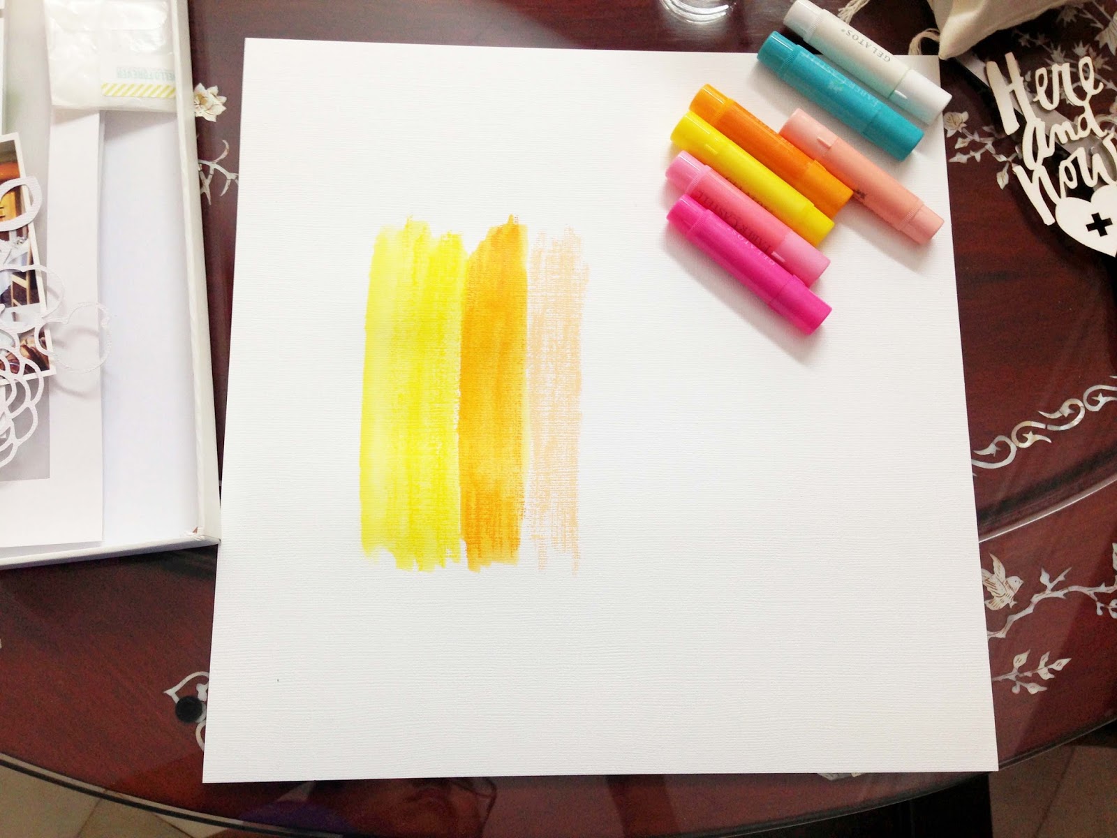
i selected some gelatos and colored on a piece of white cardstock. i love gelatos, they are creamy and are like a combination of crayons and watercolors. i color the gelatos the same way i would with crayons and i use a wet brush to blend the colors and the end results looks like a more vibrant version of watercolors. when i am working on studio calico kits, i usually decide on the colors to use base on the mood board. this way, i am sure that the colors would coordinate perfectly with the kit. 


i used this subjective moodboard by ania maria and decided on the different shades of yellow and pink and some mint green.


i do not have a mint green in my set of gelatos so i usually use blend green, white and a bit of blue and yellow. however, this time, it didn't turn out as well as i want! in fact, i thought it will be better without the mint green. so i decided to cover it with a piece of patterned paper. 


here's how it looked after covering the green.


next i decided on the placement for my photos and added a die cut i cut using my silhouette cameo. this floral die cut is an exclusive for studio calico july kits designed by kim steward.


i wanted to layer my photos a bit, so i added some vellum. next i added some stickers base on the background color. there are no embellishments that can match the bright pink so i cut the butterfly from one of the patterned papers - under the boardwalk. 


at this point, i thought the page doesn't look so balance with the butterfly at the top so i shift it down and felt it looked better. i also added another strip of black and white patterned paper on the left side. i used the water-colour die cuts - here and now as my title. added more stickers, some buttons and enamel dots. lastly, my journaling and stamp date and the page is complete!

all products used are from studio calico penny arcade main scrapbook kitskee ball (add on 1), fortune teller (add on 2) and spun sugar (add on 3)

thanks for dropping by and i hope you enjoyed this simple tutorial. have a great weekend!

xoxo
lilin

Friday, 6 June 2014

A Closer Look - FIVE

hello! today i would like to share a tutorial of how this layout came together. i made this layout to celebrate my 5th wedding anniversary. 


this layout was inspired by this image i found on pinterest.


when i saw the image, i thought that i will be fun to add these origami hearts to my layout. so i went to search for my origami book i had since i was a child and found a page on how to fold these little hearts...


1. cut a piece of patterned paper into a 2.25 X 2.25 inch square.

2. fold it in half and open it back up.

3. fold the other side of the square in half. however, this time, do not press it down and create a crease across the square. instead, just press down in the middle where the arrow is pointing. this creates a little crease in the middle. 

4. open it back up.


5. fold the top point of the paper to meet the little crease in the centre (the crease made in step 3).

6. fold the bottom point to meet the top.

7. fold the left side to meet the crease in the centre (the crease made in step 2).

8. press it down.


9. fold the right side to meet the crease in the centre.

10. flip the paper to the back.

11. fold the 2 top points of the heart and the right and left sides of the heart as shown.

12. flip the paper to the front and it's done!

for this page, i went ahead and made 5 hearts using different patterned papers. i choose the colors base on the gems that were included in the kit.


once the origami hearts are done, i wanted to create a background with watercolors. i used the watercolor paper that was included in the kit and the essentials watercolor seti wanted get a flowy (if there is such a word) effect so i added more water and used a straw to blow the watercolors and water in different directions. this was how it looks like after 2 colors. 


i basically used the gems to decide what are the colors and in what order to paint them. 


this is how it looks like after i added all my 6 colors. love how the colors matches the hearts perfectly.


after the watercolors are dried, i went ahead to decide the placement for my photo. to layer my photo, my favourite way is to add a piece of vellum. i usually use my photo as a guide a fussy cut a piece of vellum that is slightly larger. then i went ahead to add my origami hearts, matching the colors of the hearts with the watercolors. next i added some die cut leaves i cut using my silhouette cameo. you can see now that most of the watercolors are actually covered in the end, but i love the subtle colors that are peeking from the sides and around the hearts.


next, i added my title with beautiful mint green acetate alphas ( i love these alphas and might have used it in 3 out of the 4 layouts i made for the reveal this month!) and added a gold label (another favourite item) for my journaling.


i scattered some gems on the layout. i  place each gem to match the watercolors in the background. i added my journaling and date stamp and the layout was done!


i hope you enjoyed this tutorial! if you do create any projects with these origami hearts, do share them with me as i would love to see them! 

and if you like to find out more about this fabulous kit i used, check it out here! you will also be happy to know that there is a promotion going on now for new subscribers - $10 off your first month. details are as follows:


thank you so much for dropping by and i hope to see you soon!

xoxo
lilin

Thursday, 8 May 2014

A Closer Look - I Adore You


hi! i'm here to share a quick tutorial of this layout i made with studio calico camelot main scrapbook kit. this layout is inspired by this exclusive scallop dot cut file designed by paige evans and the new set of gelatos i bought.


i used my silhouette cameo to cut the scallop dot file in 6 x 8 inch and will be used as my stencil. to create some texture, i used gel medium. however, gel medium is transulcent so i mixed in some gesso to give it a opaque look. i place the stencil on my white cardstock and applied the gel medium + gesso mixture. 


since i wanted the scallop dots to appear over my 12 x 12 inch paper, i had to overlap the stencil which is not a very good idea as some of the gel medium smudge when i did that. i would suggest to either  wait for the gel medium to dry before overlapping the stencil or cut the stencil in 12 x 12 inch. 


after the gel medium has dried completely (i left mine overnight), i applied a rainbow of gelatos over the scallop dots. then i blended the gelatos with water and a brush. as i am applying the water on the gelatos, i allowed the water to drip and flow to the sides of the paper. another point to note here is i should have allowed one color to dry completely before blending the next. i didn't, so there were some mixing of colours :P


here's how it looks like after blending the gelatos and letting it dry. love how the gel medium resist the paint and how the dots shows. 


after playing with the placement of the photo, i decided to turn the page around. i choose to place the photo near the blue paint to match ethan's blue shirt. i layered a piece of vellum below my photo to add some dimension. i die cut one of the digital stamp designs by suzy plantamura - i adore you and used it as my title.


next, i used the patterned papers in the kit to fussy cut some hearts. i place them on the page according to the color of the paint. since i don't have any gold papers, i fussy cut the heart from white cardstock and colored it gold using my gold leafing pen. 


i also added the hello and hearts from dear lizzy gold rub ons and some gold enamel dots. i place them where the gold paint is.
to finish off the page, i added my journaling and adhered the page on a piece of yellow patterned paper.

and there you have it! i hope you enjoyed this tutorial!

if you want to find out more about studio calico kits, you would be happy to know there is a promotion going on now! so this means you can start a subscription now with the camelot kit and cancel anytime with no cancellation fee. 


click on the following to start a subscription for:

on the page, click on start a subscription to add the kit to your shopping cart and remember to use promo code: NORISK14

thanks for dropping by and see you soon!

Friday, 4 April 2014

A Closer Look - His Vs Hers


studio calico bluegrass farm kits have started to ship! many of you will be receiving the kits very soon, so i would like to share a quick tutorial of how this layout came together. i made this layout using the main scrapbook kit.


i started the layout by grabbing this semi circle stamp from the kit and created a scallop banner design in various colors on white cardstock. i used color theory ink pads in deja blue, yes peas, sunny day, orange country and well red here. to create a ombre effect, I stamped the ink once and press it down on the paper 2 or 3 times. the inks are really juicy and the colors can be seen quite clearly even on the lightest tone. i have always stamp in black before i got these color theory inks. i did try stamping in color previously but the colors didm't turn out as well and looks botched so i thought maybe stamping isn't for me. so i'm glad i tried these new inks from studio calico. i'm very happy with the stamped images and thought they look quite good for an amateur! it also helps a lot that i’m using the  compact stamp press from fiskars. it has these grids that helps me make sure that my scallop banner is relatively straight!


this is how it looks like after the stamping is done.


to add more interest to the scallop banner, i punched little hearts and stars from the patterned papers in the kit. then i adhered the hearts and stars around base on the colors of the banner. i also arrange my photos on the layout to see how it looks. love these 2 photos of ethan when he was about 7 months old.  a photo of him smiling sweetly and the other of him crying. i took these 2 photo in the span of a few minutes! that’s how babies are, one minute they are happy and the next -crying! ok, getting back to my tutorial! :P at this point, the page still seems a bit plain and i thought it could do with more color and some mess.


 so i decided to add some ink splatters using mister huey mist and i started with the first color on my rainbow banner – blue. i didn’t want the blue color ink splatters to mess up the other colors. hence, i used a piece of rough paper and covered the rest of the layout before i added splatters with navy blue mist.


after the blue inks are dry, i worked on the green portion of the layout. as you can see, i covered the blues and the rest of the colors before applying the green ink splatters in mistletoe.


i repeat the same until i added ink splatters to the rest of the colors. this is how it looks.  i used double yellow for the yellow portion and mary mary for the red portion. i don’t have a mist for orange so i skipped that and thought it looks fine.


once all the inks are dry, i added my photos. since the background is already quite busy, i didn’t layer my photos with any patterned paper. instead i used vellum for that extra layer and it helps my photos stand out from the background. to finish off the page, i form my title with the cute mini badges and woodgrain ghost alpha from the kit. i also added my journaling using the sticker labels included in the kit as well. and the layout is complete!

i hope you enjoyed this tutorial and feel inspired to use your   ink pads!

Saturday, 1 March 2014

A Closer Look - Silhouette Sketch Pens


hello! i'm back to share how i used silhouette sketch pens in 2 of my layouts with this month's kit - office hours.

i used the gold pen from the metallic pack here.


i used the black pen from the glitter pack here.

here we go...

first, i opened the cut file by paige evans in silhouette studio. 


to get the silhouette cameo to start sketching, i made sure i had the following cut settings:
1. select silhouette sketch pen under media
2. ensure that speed is set as 10 and thickness is set as 18
3. select sketch pen under blade adjustment

next remember to change your blade to a sketch pen before you start. 


after about 10 mins of drawing on white cardstock, i had this beautiful background paper.

a good range of silhouette sketch pens can be found in the studio calico shop and if you would like to use your own pens for sketching, you can do so with a silhouette pen holder

i hope this simple tutorial will help you start your first sketch. thanks for dropping by!

Friday, 14 February 2014

A Closer Look - Happiness

this is one of my favourite layouts i made with the sugar rush kits - happiness. the inspiration for this layout started with these little vellum hearts that came with the main scrapbook kit. here's a little peek into how this layout came together...


i was playing around with the vellum hearts and randomly placing them on a white card stock when i realise i could make a pretty rainbow with them. so i grabbed my watercolors and began painting with colors that match the little vellum hearts. i used the peerless watercolor papers here. what i love about these watercolor papers is that they come in 40 colors so its easy to find matching colors with whatever embellishment or paper i am working on. 


i waited for the watercolors to dry and i placed my photo in the middle, letting the watercolors peek above and below the photo. i also layered my photo with vellum and a piece of gold punchinella vellum from rock candy.


next i adhered the vellum hearts across the photo according to the rainbow of watercolors. then i added some other elements like the gold-tipped leaf, chipboard stars, camera, enamel dots and resin flower pin. 


... added the title - happiness at the top of the photo. i love how the watercolors look behind the gold alphas from the gum drop add on.


 ... and i added the speech bubble cut file by hello forever and scattered some neon sequins at the top left and bottom right side of the page.

to finish the page, i trimmed about 1/4 inch off the sides of the cardstock and adhere it to "word soup" paper by my mind's eye found in rock candy.

there you have it! the page is complete! i didn't take much photos when i was working on the page this time, so i used my final photos for this little tutorial. will make a mental note to remember to capture some progress shots for the next tutorial!

thanks for dropping by and happy valentine's day!!!