Monday, 30 June 2014

Penny Arcade Reveal

hello! i'm back to share my layouts for studio calico july kits - penny arcade! i'm sorry that i am late in sharing this blog post as june has been a very busy month for me! this month's kit is one of my favourites! i love love love the colours! and the papers from ashley goldberg! and the exclusive cut files are just as amazing... glad i cut a whole bunch of die cuts with my silhouette cameo!

i was happy to work with the main scrapbook kit, skee ball (add on 1), fortune teller (add on 2) and spun sugar (add on 3). if i have to choose one favourite this month, it will be the main scrapbook kit! love the ashley goldberg papers, the lovely brush script travel journal paper, cute cloud paper by life-love-paper and stamp stickers! the kit is filled with lots of exclusive papers and embellishments!


here's a look at what i came up with...

london 
(main kit only)


the patterned paper in the kit are so pretty, i wanted to use as many as i could on a layout so i decided on a grid design. i printed 3 photos in 3 x 3 inch and cut 4 patterned paper into 3 x 3 inch squares. after deciding the placement for the photos, i layered each one with a piece of vellum. 
for the first square, i used some pink thread and hand stitched the city - london since my photos are of my trip to london! i love the stamp stickers so i cut part of it and used it as one of the squares on my grid. i wanted to keep the design simple so i decorated the rest of the patterned papers with a doily and some die cuts from kim steward and in a creative bubble. then i thought this page could do with more yellow, so i trim a 3 x 3 square from white card stock and colored it with some gelatos. i used lemon and buttercup yellow here. then i stamped "the sky's the limit" with color theory sunny day. to finish off, i added my journaling, date stamp and a small strip of white crepe paper.

hello world
(main kit only)


when i saw this cute cloud paper, i thought it's perfect for scrapping ethan's first photos! love how well the clouds die cuts by paige evans complements the cute clouds on the paper. after i decided on the placement for the photo, i layered it with vellum, a doily and patterned paper. i place some white crepe paper beneath the photo like a little banner. i also added a cluster of embellishment at the side of the photo with the stamp stickers, flower die cut by hello forever and xo metal circle badge. to make the die cut clouds stand out, i outline them with my precision pen

you are my favourite
(main kit, fortune teller, spun sugar)


used mostly fortune teller in this layout. just like my london page, i wanted to use as much of the pretty patterned paper as possible so i cut the papers into little rectangles and place them together with my photo, some crepe paper and journaling card by hello forever, something like a jigsaw puzzle. this is why i love working with a kit for such a design, because the papers are well coordinated and i don't need to spent time making sure they look good together. then i started layering the october afternoon stickers and used the heart shaped die cut by kim steward to frame my photo. to make the words 'you are my favourite' stand out, i cut strips from the patterned papers and layer it beneath the journaling card.

here and now
(main kit, skeeball, fortune teller, spun sugar)


i started this page by coloring some gelatos on white card stock. then i added some black and white strips of patterned paper on the left hand side of the page as a contrast to the colourful background. i place my photos in the middle of my painted background and added a floral die cut by kim steward. this die cut is my absolute favourite! love how the colors peep through the die cut. to add more interest to the page, i layered some stickers, gold enamel dots, buttons and the little butterfly i cut from under the boardwalk paper from fortune teller. lastly, i added the now and then watercolor die cut, journaling and date stamp. 

i hope you have enjoyed my reveal of penny arcade and i will be back soon with a tutorial for one of the layouts!

also, the enrolment for inked 2.0 is almost closing, if you are interested to find out more about the class, click here!

xoxo
lilin

Inked 2.0 At Studio Calico


have you signed up for inked 2.0 at studio calico? registration ends june 30th at 11:59pm est so it's your last chance to sign up! learn 20 new ways to get more from your stamps with Lisa Spangler and Tina Aszmus in this new class! 

here's what you will receive:
  • 4 videos and 16 step by step tutorial PDFs sharing techniques for getting more from your stamps.
  • 40 all new projects (layouts, cards and pocket pages) featuring stamping
  • a class message board and gallery where you can interact with your teachers and fellow students
  • challenges during the month of July

and here's a look at the digital goodies you will be getting when you sign up for the class!


printables from hello forever and life.love.paper


digital cut files from 
hello forever, shanna noel and paige evans


layout and card templates from shanna noel

you will also be happy to know that some exclusive stamp sets are available...


dress up the house with these house guest...


for more class supplies, you can click here.

if you would like to sign up or find out more details on this class, click here!

the class starts on july 1st! hope to see you there!

xoxo
lilin

Friday, 27 June 2014

Penny Arcade Sneaks


hello! i'm back to share some sneaks for studio calico july kits - penny arcade. as the mood board shows, this kit is filled with beautiful colors, cute elements, brush scripts and everything else that screams summer! it's such an amazing kit to work with and i think you will understand what i means when you see the kits yourself! for now, i can only show you some sneaks and hopefully that will help you tide over the next 1.5 days until reveal. 


this is a main kit only page. presenting my favourite paper this month! it totally inspired me to scrap my holiday photos which has been put aside for so so long...


this is my second main kit only page. i'm in love with clouds now. can't get enough of this cute cloud paper and the cloud die cuts designed by paige evans... i used my precision pen to outline the die cuts so that they will stand out against the background paper.


for this page i used mainly fortune teller (add on 2) with bits and pieces from the main scrapbook kit and spun sugar (add on 3)... lots of layering with the goodies here...


and here's a look at my favourite layout! i used a mix of the main scrapbook kit, skeeball (add on 1), fortune teller (add on 2), spun sugar (add on 3). love how the gelatos peep through the beautiful die cut designed by kim steward.

i hope you enjoyed my sneaks. thanks for dropping by and see you at reveal!

full reveal is on 27th at noon EST/ 11am CST for subscribers and  27th at midnight EST/ 11pm CST for non subscribers.

xoxo
Lilin

Tuesday, 10 June 2014

Elle's Studio June Inspiration Gallery

you will be happy to know that elle's studio june kit and inspiration gallery are now live! i hope you are up for some big shopping spree this month because there are lots of goodies stock up for you!


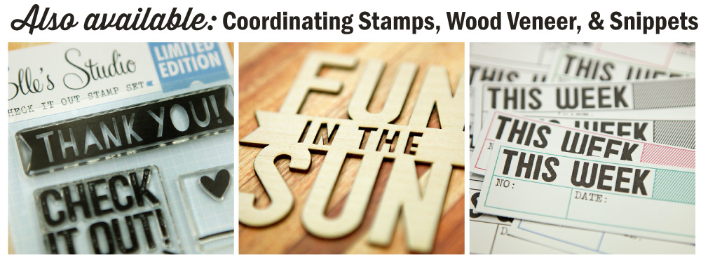
exclusive june kit with coordinating stamps, wood veneer and snippets... and of course cut files!

these kits are going for $9.99 from now until the end of today (after 12.01 am on the 11th, it will retail for $11.99)! so grab yours now!


and... an exclusive foodie mini collection! how cute are these? this collection includes tags, a stamp set and wood veneers...

here's a look at what i made this month!

today is your day to shine


i created this layout by layering all the goodies from the new shine collection and june's exclusive kit! love the transparent hearts in the kit and the cute wood veneers from shine. to make my title stand out, i added some hand stitching to the word shine...

sand in my toes


for this layout, i gathered stamps from the shine collection, june kit , everyday moments and love you more collections to create a black and white background. when i was stamping, i didn't worry too much about where to stamp, or how it would turn out. i had lots of fun creating the background and i love how it turned out! once the background was done, i layered my photo with journaling cards from the june kit, doily, a piece of vellum and some tags. i also added the heart shaped wood veneer and label for my title and my page was complete. 

sunshine documented mini album


when i first saw the wood veneer mini album covers, i knew i had to make use of them! I printed my photos in 2 sizes - 3 x 4 inch and 3 x 3 inch. my mini album came together easily as I filled it up with journaling cards and transparent tags. for final touches, i added some die cuts, tags, labels, wood veneers, clips and washi tape.

here are some of my favourite pages...


my favourite pieces of shine are these cute ice cream wood veneers and the transparent tags! 


i cut this journaling card from shine lil'snippet - highlights. love how easy is it to add my journaling on one of these cards...


and i couldn't resist using these fun tags from shine - bits and pieces...

i hope you enjoyed these projects i created for elle's studio june inspiration gallery. to see more pictures of my layouts and mini album as well as the list of products used, visit my gallery here... do check out projects by the rest of the talented design team too!

oh and while you are shopping at elle's studio, do remember to enter these promotion codes to enjoy free shipping till 17th june 2014! happy shopping!!!


thank you for dropping by and see you soon!

xoxo
lilin


Friday, 6 June 2014

A Closer Look - FIVE

hello! today i would like to share a tutorial of how this layout came together. i made this layout to celebrate my 5th wedding anniversary. 


this layout was inspired by this image i found on pinterest.


when i saw the image, i thought that i will be fun to add these origami hearts to my layout. so i went to search for my origami book i had since i was a child and found a page on how to fold these little hearts...


1. cut a piece of patterned paper into a 2.25 X 2.25 inch square.

2. fold it in half and open it back up.

3. fold the other side of the square in half. however, this time, do not press it down and create a crease across the square. instead, just press down in the middle where the arrow is pointing. this creates a little crease in the middle. 

4. open it back up.


5. fold the top point of the paper to meet the little crease in the centre (the crease made in step 3).

6. fold the bottom point to meet the top.

7. fold the left side to meet the crease in the centre (the crease made in step 2).

8. press it down.


9. fold the right side to meet the crease in the centre.

10. flip the paper to the back.

11. fold the 2 top points of the heart and the right and left sides of the heart as shown.

12. flip the paper to the front and it's done!

for this page, i went ahead and made 5 hearts using different patterned papers. i choose the colors base on the gems that were included in the kit.


once the origami hearts are done, i wanted to create a background with watercolors. i used the watercolor paper that was included in the kit and the essentials watercolor seti wanted get a flowy (if there is such a word) effect so i added more water and used a straw to blow the watercolors and water in different directions. this was how it looks like after 2 colors. 


i basically used the gems to decide what are the colors and in what order to paint them. 


this is how it looks like after i added all my 6 colors. love how the colors matches the hearts perfectly.


after the watercolors are dried, i went ahead to decide the placement for my photo. to layer my photo, my favourite way is to add a piece of vellum. i usually use my photo as a guide a fussy cut a piece of vellum that is slightly larger. then i went ahead to add my origami hearts, matching the colors of the hearts with the watercolors. next i added some die cut leaves i cut using my silhouette cameo. you can see now that most of the watercolors are actually covered in the end, but i love the subtle colors that are peeking from the sides and around the hearts.


next, i added my title with beautiful mint green acetate alphas ( i love these alphas and might have used it in 3 out of the 4 layouts i made for the reveal this month!) and added a gold label (another favourite item) for my journaling.


i scattered some gems on the layout. i  place each gem to match the watercolors in the background. i added my journaling and date stamp and the layout was done!


i hope you enjoyed this tutorial! if you do create any projects with these origami hearts, do share them with me as i would love to see them! 

and if you like to find out more about this fabulous kit i used, check it out here! you will also be happy to know that there is a promotion going on now for new subscribers - $10 off your first month. details are as follows:


thank you so much for dropping by and i hope to see you soon!

xoxo
lilin

Tuesday, 3 June 2014

Digital | Beyond The Basics At Studio Calico

hi! i hope you had a good weekend and is fully recharged for a new week ahead! today i would like to share about a digital scrapbooking class at studio calico - digital | beyond the basics


the class will be starting today and i am so excited to be learning from the talented shanna noel as she shares with us 20 cool techniques to get more from the beautiful digital files that studio calico offers each month. we will be exploring ways to do more with templates, stamp brushes, digital paper, printables and digital die cuts both on computer and paper crafting projects. if you would love to learn more about digital/ hybrid scrapbooking, this class is for you!

here's what you'll get:
  • 10 how to videos from myself covering techniques for templates, stamp brushes, digital paper, printables and digital die cut files
  • 10 tutorials from the contributors covering techniques for templates, stamp brushes, digital paper, printables and digital die cut files
  • 20 new digital / hybrid projects to inspire you
  • a class message board to interact with myself and your fellow students
  • new challenges each week
and here's a look at the digital goodies you will be getting when you sign up for the class!


here's what you need to start the class:
  • photoshop or photoshop elements (pse)
  • basic digital scrapping skills - if you haven't got the basics, no worries! you can check out this free digital class at studio calico to brush up!
if you would like to sign up or find out more details on this class, click here!

i know nothing about hybrid scrapbooking so i am so excited to get started! hope to see you in class!

lilin